What is alt text and why is it important?

"Alt Text" is short for "alternative text" and is sometimes referred to as an "alt tag." It is a short text description of an image that is used when the image itself cannot be viewed. Think of it as how you would describe a photo to someone over the phone without them being able to see it.

Adding alt text makes images accessible to users with visual impairments, low sight, dyslexia and other disabilities. When a screen reader comes across an image, it reads the alt text aloud. Users with sight-related disabilities rely on these descriptions to understand the meaning and context of all images on a webpage.

Alt text will also display when you hover your mouse over an image or when an image will not load for whatever reason (slow wifi, poor internet access, etc.)

Alt text is the responsibility of web maintainers for each website. It should be no longer than 100 characters (including spaces and punctuation) and must include all text on an image. Avoid images with too much text including infographics, posters, flyers, etc. Search engines, like Google, scan alt text so having good alt text is a way to better your search engine results.

How to check your Alt Text

You can check your character length by pasting the text into Microsoft Word and selecting Review and Word Count. The pop-up listing will include "characters with spaces" this is the number you need at 100 or less.

How to write good alt text

The alt text within the image component should typically:

  • Be accurate and equivalent in presenting the same content and function of the image.
  • Be succinct. This means the correct content (if there is content) and function (if there is a function) of the image should be presented as succinctly as is appropriate. Typically no more than a few words are necessary, though rarely a short sentence or two may be appropriate. Current guidelines suggest 100 characters or less (including spaces between words and punctuation) but some screen readers will read to about 140 characters.
  • NOT be redundant or provide the same information as text within the context of the image.
  • NOT use the phrases "image of, picture of or graphic of ..." to describe the image. It is usually apparent to the user that it is an image. 
  • Use the subject's name and do not identify a person by their race, ethnicity or gender in the text but rather as a "person" or "student." Describe only what you see and you what know to be true about the photo.

Using correct grammar can enhance the experience for screen reader users:

  • Capitalize the first letter
  • End the alt text with a period. This tells a screen reader that it has reached the end, to pause and stop reading.

Examples

Please click on the plus signs below to expand sections with examples of different types of images and alt text.

The key to writing good alt text is to describe the image as accurately and in as few words as possible. Think of it as how you would describe a photo to someone over the phone without them being able to see it.

When you upload an image you should see a pop-up window labeled Metadata.

Metadata window: *Image alt text: highlighted. Other headings: Image width, Image height, Image Properties: Image Alignment: center.

This screenshot shows the window you are given when uploading an image into Tridion Site Edit. As you can see from the highlighted section, Image alt text is required. An image cannot be saved without alt text.

If you've uploaded the image with insufficient alt text and need to adjust it, you will first need to navigate to the folder where you uploaded the image. After double clicking to open it, you'll see a series a tabs: General, Metadata, Bundles, Workflow and Info. Click on the Metadata tab to access the alt text field.

Metadata tab: Image alt text: UMass Lowell Image. Other tabs: General, Bundles, Workflow, Info.

In the Metadata tab is where you will find the section to update the alt text. In this example the image was uploaded with incorrect alt text: "UMass Lowell Image".

UMass Lowell Mascot, Rowdy the River Hawk, taking a selfie photo with a student.

Example

Over-Explanatory Alt Text: Giant blue and red bird points at a male student's face while he takes a selfie photo with phone. A wooden brown background is behind then and a silver wall is to their left.

Better Alt Text: UMass Lowell Mascot, Rowdy the River Hawk, taking a selfie photo with a student.

Profile images need alt text that names the subject for those who cannot see the image.

For profile images, the format should always be the person’s name followed by a period: “[Name].”

Julie Chen

Example

Over-Explanatory Alt Text: Headshot of Julie Chen from the shoulders up smiling and wearing blue dropdown earrings.

Correct Alt Text: Julie Chen.

Logos and marks may seem self-explanatory, but they still communicate brand information and require alt text for screen reader users.

  1. Say that the image is a logo. Since screen readers do not understand the difference between logos and other images, using the word "logo" helps users understand the image's purpose.
  2. Include any text in the image. Like all other types of images, your alt text must include all words in the logo as screen readers cannot access that text in any other way.
  3. Follow the standard format. For logos, the format should always be "[Organization name] logo."
UMass Lowell logo.

Example

Incorrect: logo

Correct: UMass Lowell logo.

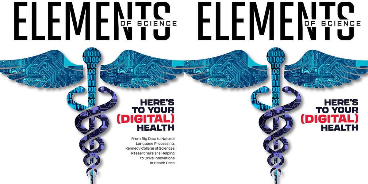
The same Elements of Science magazine cover side by side. 1 with less text, both have a stylized Caduceus & Here's To Your Digital Health.

The original Elements of Science Magazine cover (left) has been photoshopped to remove some text: "From Big Data to Natural Language Processing, Kennedy College of Sciences Researchers are Helping to Drive Innovations in Health Care". The cover image on the right has white space over that text to make the image accessible and the alt text to fit within the 100 character limit.

Magazine and book covers are typically images with text.

Consider whether being able to read that text affects a user's ability to understand the concept represented.

Alt text is limited to 100 characters including spaces.

As best as you can, crop the image to limit the amount of text, then include all visible text in the alt text description. You can also photoshop the image to remove extra text that you can't fit into the 100 character limit.

Magazine Cover: Elements of Science with stylized Caduceus and words Here's To Your Digital Health.

Example

Incorrect: Elements of Science magazine cover.

Correct: Elements of Science magazine cover with stylized Caduceus & the words Here's To Your Digital Health.